
What Colour Schemes to use?
Now that I have created a contents page and front page plan, I will now photocopy these final images and paint the images, using different colour schemes. Below are several different colour schemes i have used, on both the contents page and front page final plans.
Firey Red
Cool Blue
 Mixture of Ideas
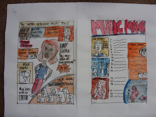
Colour Schemes For Magazine
I have photocopied the two storyboards, and then used water colour paints to see what colours look best on each of the pages, one photocopy is of my intended Front Page and the other is my intended Contents Page. I decided that I wanted my magazine to look colourful, but in an organized way. I came up with two schemes that I was happy with, “Cool Blue” and “Fire Red”. The cool blue colour scheme I thought would be a good way of showing audiences that the stories and content is “cool!” The “Fire Red” colour scheme I thought would be a good way of showing audiences that the stories and content of the magazine is “hot” and “news just in”. I then thought I could combine these two ideas, however, the results I don’t think look so successful. It is very messy, and there are no clear definitions of whether the magazine is hot or cold! Using clear bold colours that combine to create an instant message is what I intend to have done. I have decided that in order to put this message across clearly – I am going to use the “fire red” colour scheme, as there are a variety of colours that can be used; red, orange, yellow and white. I have done both the front cover and contents page at the same time, because they will need to match in the magazine. When I come to create the double page spread I will follow the “fire red” colour scheme also.

No comments:
Post a Comment